Maybe Apple's latest Liquid Glass changes will be enough to silence critics, but most users will never even think to look. Here's what they look like, where they are, and what you can change.
It's been the case for a year now that a certain vocal minority has detested Apple's Liquid Glass design overall, while others objected to its inconsistent rounded corners. Everybody had a point, but the enormous majority either liked the design, or didn't especially notice a difference.
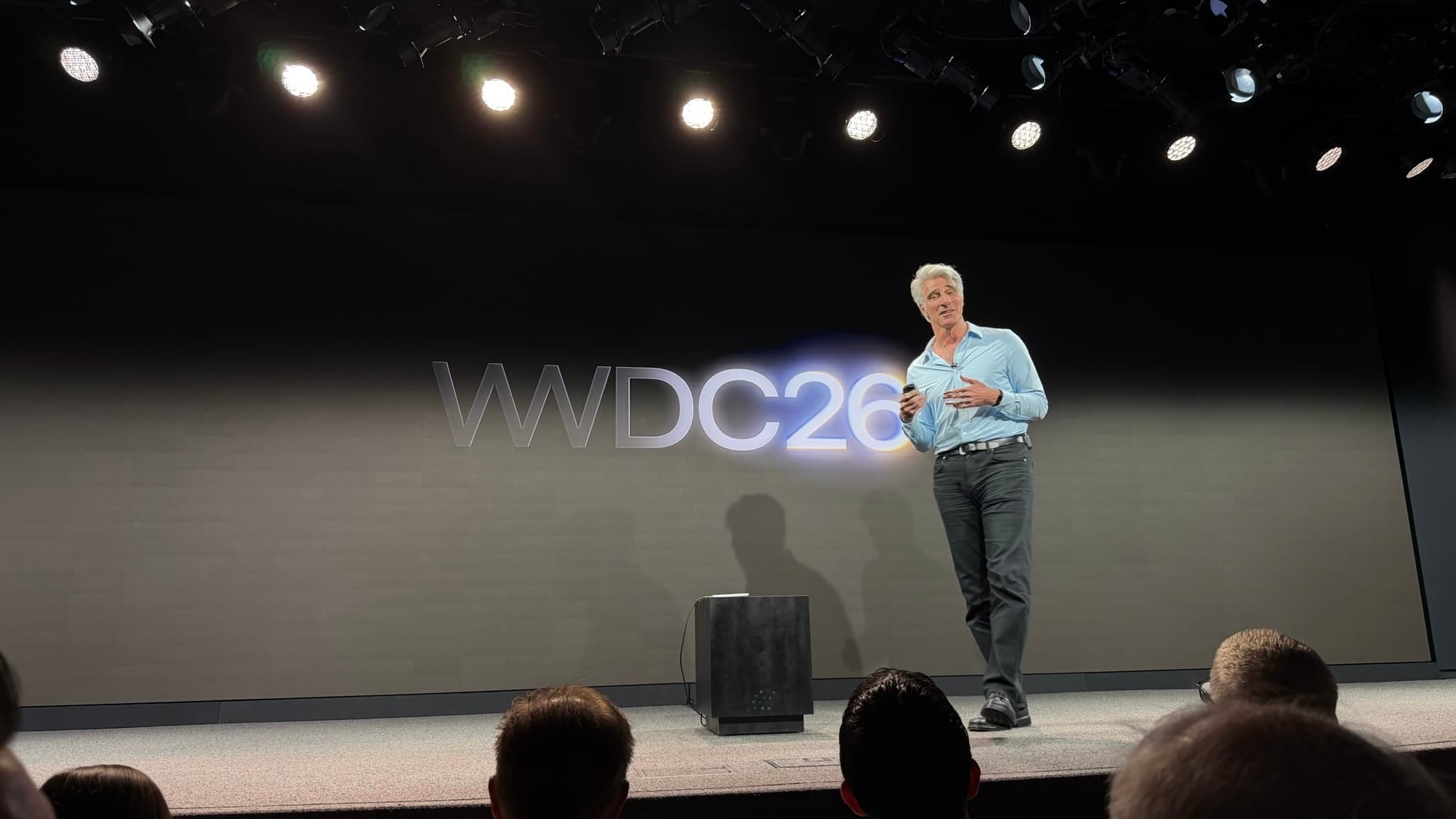
During WWDC 2026, though, Apple tried to make peace, even as it also wanted you to know it was standing its ground. Its designers heard the complaints, said Apple, but it was never going to ditch Liquid Glass.
"Like with all major design updates, there is a natural process where we take a bold leap forward, and then we continue iterating," said Shubham Kedia, Director, Human Interface during the keynote. "Our team really appreciates your feedback, and we considered it deeply as we refined the new design over the past year."
He then introduced the new slider, which allows users to control just how transparent and translucent Liquid Glass. The slider is on the Mac, iPhone, and iPad, and if you're that fussed, you have to set it up separately on each device.
Even if you do care about this, you also need to find the slider. On all devices, the slider is in Settings (System Settings on the Mac), and the Appearance section.
It is a particularly simple control that you can drag from its default center position all the way to the left and right. In order to help you see what difference this makes, there's also an example screen.
That shows what overlays look like, such as the share button that can appear atop a window. And it has various background images for you to try your setting against.

Top: Liquid Glass turned all the way on. Bottom: Liquid glass turned all the way off. Spot the difference.
The setting does make a difference. Liquid Glass does change as you slide it from left to right.
But good luck spotting any kind of meaningful change.
If it weren't for the sample background images above the slider, you would struggle to see a difference. It is more marked on the iPhone than the Mac, but barely.

The difference in Liquid Glass options is more visible on the iPhone than on the Mac, but this is still not saying much.
To be fair, your mileage will vary depending on the background of sites or other apps you use. It is definitely true that at one end of the slider, elements like search bars are closer to being opaque.
It is definitely true that at the other end, these elements are closer to being translucent.
But the difference is small, and while Apple isn't hiding that slider away, it also isn't especially promoting it. You have to know that it exists, you're not likely to stumble across it in normal use.
What this control really is, is Apple throwing a bone to its critics and asking if they're happy now. What it isn't, is anything like a major refinement of Liquid Glass.
It's also not the smallest of any of Apple's announcements for the Mac, though.
Rounded corners
This is not to knock anyone who felt macOS Tahoe was lacking Apple's usual finesse in how it had inconsistent corners on windows. But it is yet again something that only a vocal minority noticed, or at least cared enough about to criticize.
Apple has heard you, however, and it has answered. According to Apple, the corners on windows are now a correct uniform radius, and this is applied even to third-party apps.
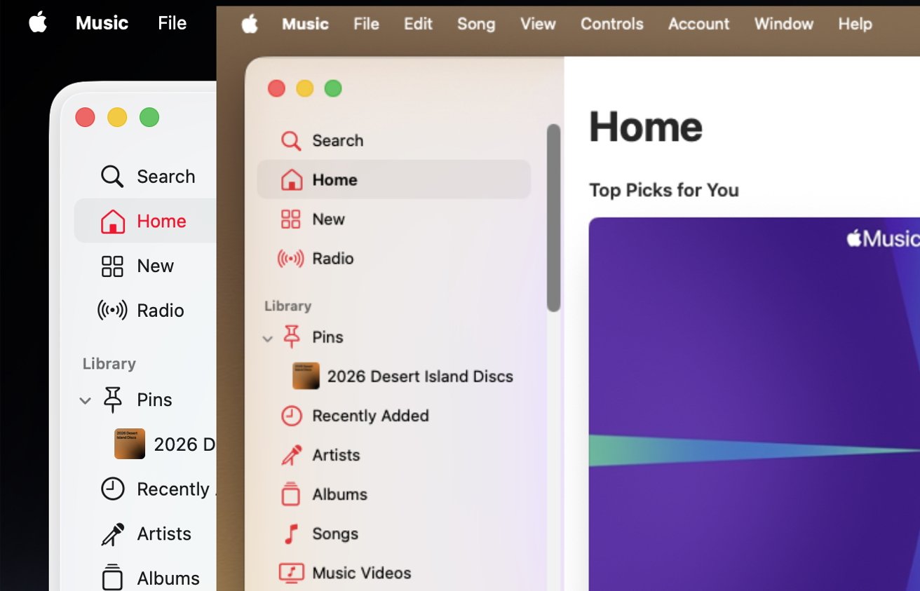
Front: macOS Golden Gate. Rear: macOS Tahoe. Spot the differences in the corner and the sidebar.
Plus in order to reduce distractions, the sidebar on Finder windows has been extended to the edge of the frame.
You may well not have noticed that it didn't before. In macOS Tahoe, the sidebar was a column of locations inset from the edge of the window, but slightly raised up.
It was as if those controls were on a plateau, and Apple has now removed that. It's given the windows a flatter look.
This time, there isn't a slider you can drag back and forth see the difference. All you can do is go back to macOS Tahoe and think oh, yes, there is a raised bit, it's true.
Small moves count
Both the fractional Liquid Glass iteration, and the polishing up of the window corners, are certainly tiny improvements. But they are improvements.
Liquid Glass was not the enormous transformation that Apple promised before and continues to claim today. But even though critics had reason to criticize, it remains that Liquid Glass is a fresh look and especially so for the Mac.
It's just curious that there seemed to be far more adjustment to the redesign during the macOS Tahoe and iOS 26 beta period than there has been since.
Whether that will continue or whether Apple will again listen to criticism during testing, remains to be seen. But if Apple only made these tiny adjustments, it didn't need to make any more.
Really, for most users, most of the time, Liquid Glass was fine as it was. It's now a little better.
But, only a little.